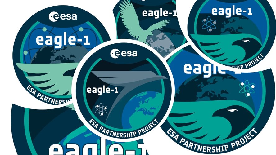
The design brief also included key points, such as that the EU countries should be highlighted, the project name should be prominent and that it is important to show that Eagle-1 is a Partnership Project. The ESA logo would also need to be included, of course.
Marco Manca, Art Director and Production Director at ReMedia, said: “The input we received was very accurate. Most of our clients are engineers, so they have clear ideas about what they want to achieve. We started with something close to their initial vision, but then added two further suggestions, each more conceptualised than the last. We usually find that the middle one works the best and that was also true in this case!”
Closely following the mock up provided by Alberto’s team, the first draft design aimed to indicate the Eagle-1 satellite orbiting around Earth. Movement was implied through use of an eagle in flight, and light and shadow on the surface to suggest rotation. The area in light also emphasised the ESA Member States. The second design retains an eagle, but with its wing embracing the planet. Europe remains clearly visible, but Earth is less dominant. In the third design, the feeling of movement of the satellite was emphasised by turning the eagle into an arrow around the planet, following an orbit.
The colours used are based on the ESA corporate visual identity. ‘Pure teal’ is used for all Connectivity and Secure Communications visuals, while shades of ‘deep space’ blue are more neutral, and part of the core ESA palate.


