The patch

Almost immediately, ESA’s design team began working on a patch that would evoke Vigil’s meaning. Throughout various iterations, the symbol of a soaring, watchful bird remained.
Emmet Fletcher, Head of ESA’s Branding and Partnership Office explained the rationale behind the patch.
“In this stunning design, the team has depicted a stylised wing of protection which shelters Earth from the Sun’s hazardous radiation. The wing emanates from Vigil’s orbital position and the critical geometry of this Lagrange point relative to the Earth and Sun is traced out. To balance out the mission patch, the L5 point is emphasised with the five stars shown just above the blue Earth.”
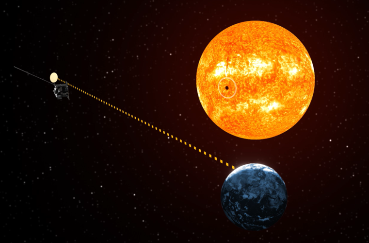
And it’s the position of the wing, originating from the side of the Sun-Earth system, which really pleased the mission team.
“We really like the patch design and how it still incorporates the vital importance of geometry to this mission,” explains Giuseppe Mandorlo, Mission Manager for ESA Vigil.
“The Vigil mission will get a sneak peek of potentially hazardous solar activity only because of its location in space. Trailing ‘behind’ Earth at the fifth Lagrange point, ESA’s Vigil will see the side of the Sun, observing conditions before they rotate around to face our home.”


